Google Maps and Google Photos are on the verge of updating their app icons, but it is a slight but significant redesign, associated with the front and back shift towards a single, AI-driven language of visual identity across Google.
What’s Getting Updated
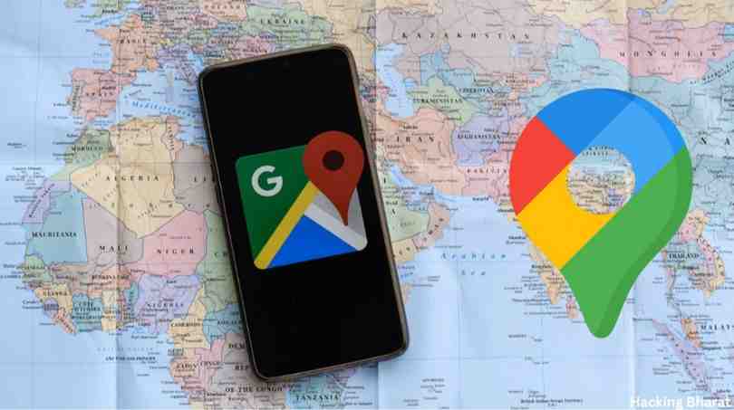
Let us begin with Google Maps. The recognizable map pin icon has been retained however, it has been intelligently redesigned. The outer form of the pin has now been made smoother and thinner.
The circle that has been inside is larger, and the old diagonal shading or lines that separate it have been eliminated (especially the two shades of blue), which gives the icon a more modernized appearance.
In the case of Google Photos, the well known pinwheel is still there. The colors have, however, changed to more smooth edges of radiating color blocks or gradients from the center to the outside as compared to the blocky colors used in the earlier version.
What comes out, the livelier icon who is at the same time a familiar one.Cosmetic alterations can be considered not only cosmetic.
According to Google, the new gradient designs represent the AI-driven innovation and creative vitality in the entire range of the products.
This visual orientation was initially used in the company in the form of its first logo, which was called G, and the brand name of one of its AI models, called Gemini.
Why the Redesign Matters
This reflection is not only the new paint job. Google is indicative of a few major changes:
- Single brand: through relocating various applications to a shared gradient and design language, Google creates a reaction of cohesion among its product universe.
- Alignment in the era of AI: The direction of the new icons is a clue to the fact that Google is launching more AI filters in its applications (such as smarter search, photo editing, and location insight). Flow, intelligence, and transformation are symbolized by the gradient.
- Sensibility of modern design: Flat blocks and clear color divisions are gradually giving way to the gentler colors and smooth transitions. The redesign enhances visual effectiveness and clarity of display regardless of the device and size.
To users the difference in the immediate effect is slight; you will still know Maps by its pin and Photos by its wheel.
However, as time goes on, the renewed appearance will establish a more unified touch among Google applications.
When Will You See the Change?
Google has not specified the date that it will roll out. Reportedly, the new icons will be visible on the Android, iOS, and web platforms in the next few months.
Users need to monitor their app updates. The update should be visible immediately after the new icons are released in the Play Store or the App Store, usually the same version of the app with a new look.
The basic operations of Google Maps and Google Photos will stay the same; just the icon of the app and its visual design will be transformed.
What You Should Know
- Your bookmarked places, photo libraries, and apps’ data will not be affected. It is nothing but a graphical update.
- A new icon might be shown on the home screen of some users prior to others due to the rollout normally being in stages, region by region.
- As the designer or frequent user of these apps, the redesigned icon may alter sometimes how it looks among other apps a bit– though the silhouette is powerful and well-known.
- A small change on the face of it, it nevertheless represents the wider change in the presentation of Google apps by the company at the time of AI and cohesive design.
The redesign of Google Maps and Google Photos icons is an intelligent proactive change by Google.
Although the transformations are aesthetic, they carry larger changes to openness, artificial intelligence, and smooth ecosystem design. Look out for your next updates.


